Zeitraum - responsive platform
ux review · data analysis · information architecture · use cases · wireframing · interface design · interaction design · prototyping · specification
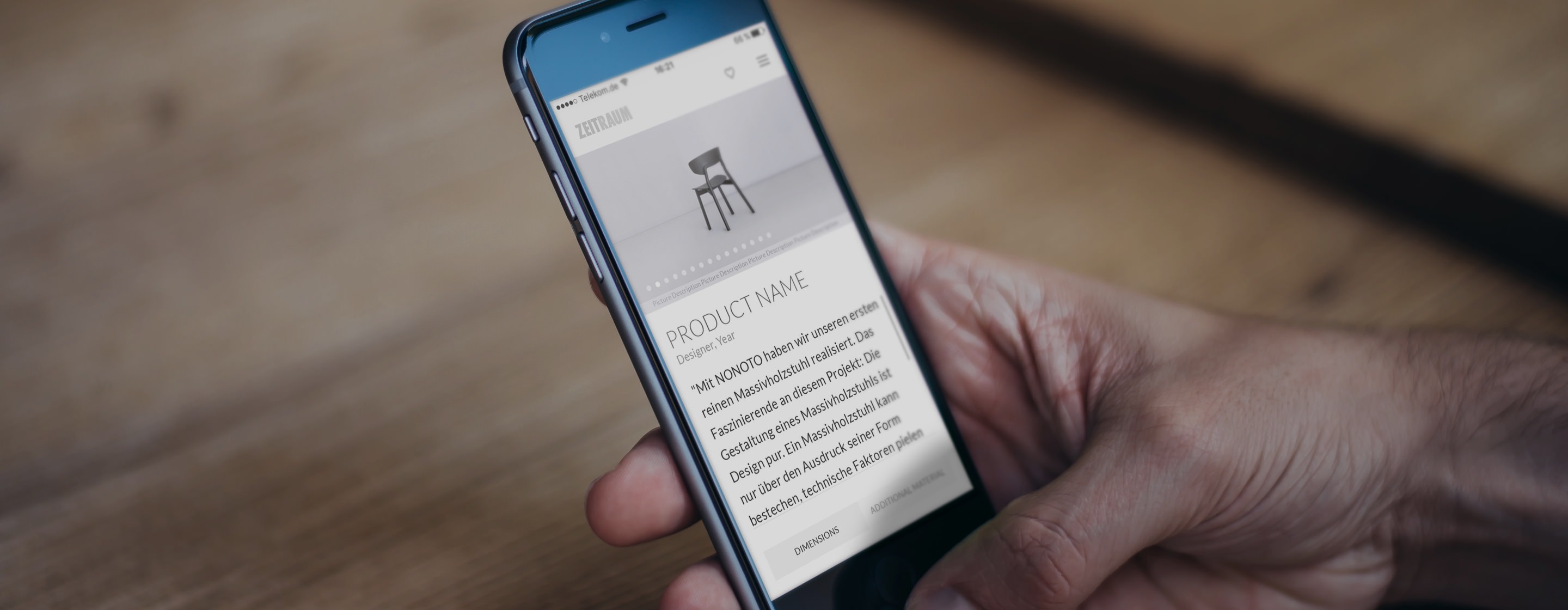
context
Based in Bavaria, Zeitraum is a top-tier furniture producer renowned for its commitment to sustainability, quality craftsmanship, and community engagement. Collaborating with Gravity, the internal team sought to enhance the website's usability and appeal while staying true to these core values. The Zeitraum website serves as more than just a brand portal; it's a vital resource offering information, inspiration, and products to end customers, architects, press, investors, and dealers.
responsibilities
Sole Interaction Designer on the project
Managing project timelines, resources, and communication.
Designing the user experience and visual elements.
Overseeing the implementation process to ensure fidelity to design vision.
Leading workshops, weekly team check-ins, client presentations, and developer meetings.
Engaging in regular feedback exchanges with the developer to review, discuss, test, and refine implementations.
Utilising prototyping and feedback cycles to align everyone with the same interactive vision.
Collaborating with Zeitraum's graphic designer to develop a new visual language that embodies Zeitraum's core values.
challenges
Restructuring and simplifying the complex site architecture and flow, without losing any key part of the original website. (Big website with many different users)
Working closely with company owners who lacked technical and UX knowledge
Usability and accessibility issues
approach
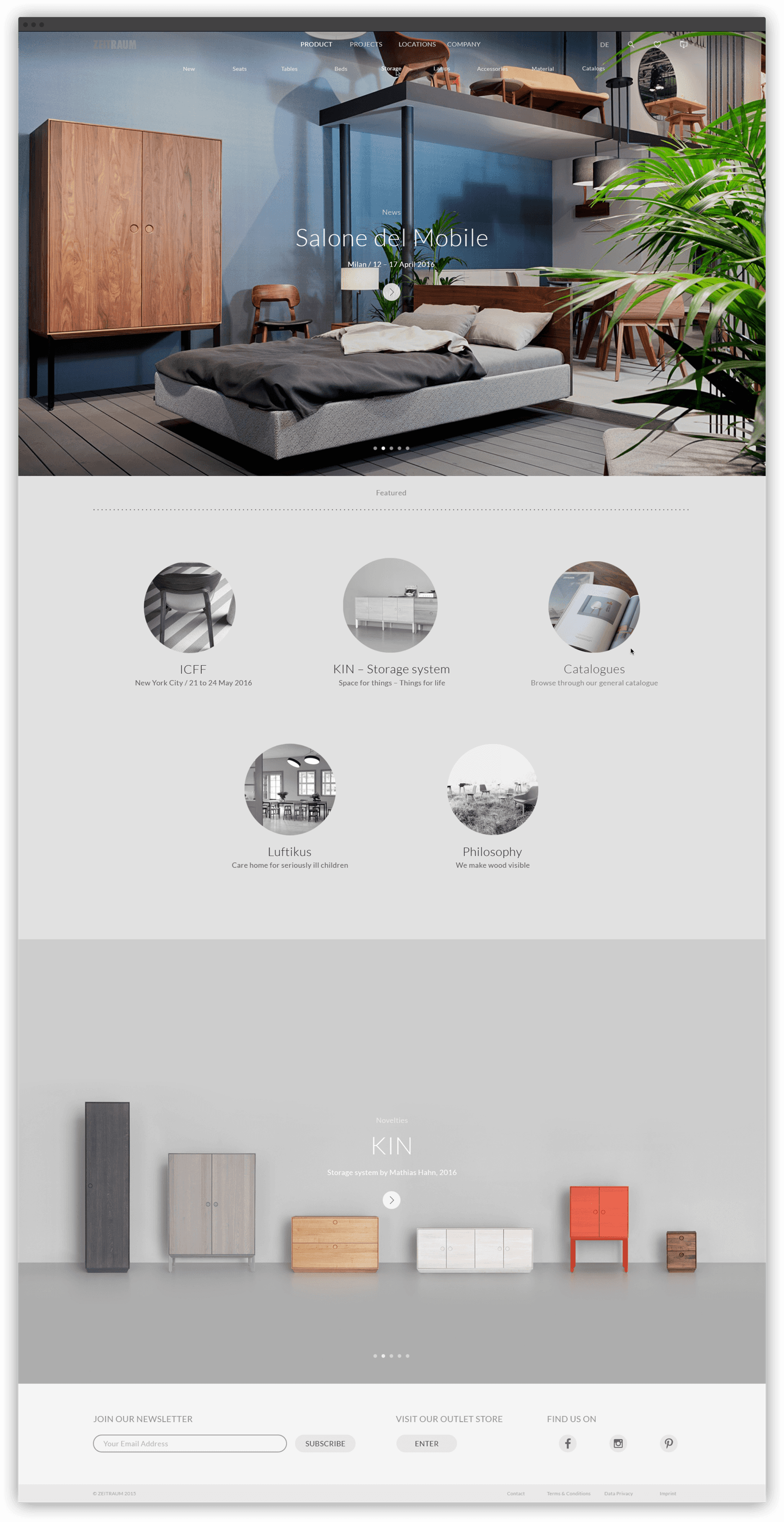
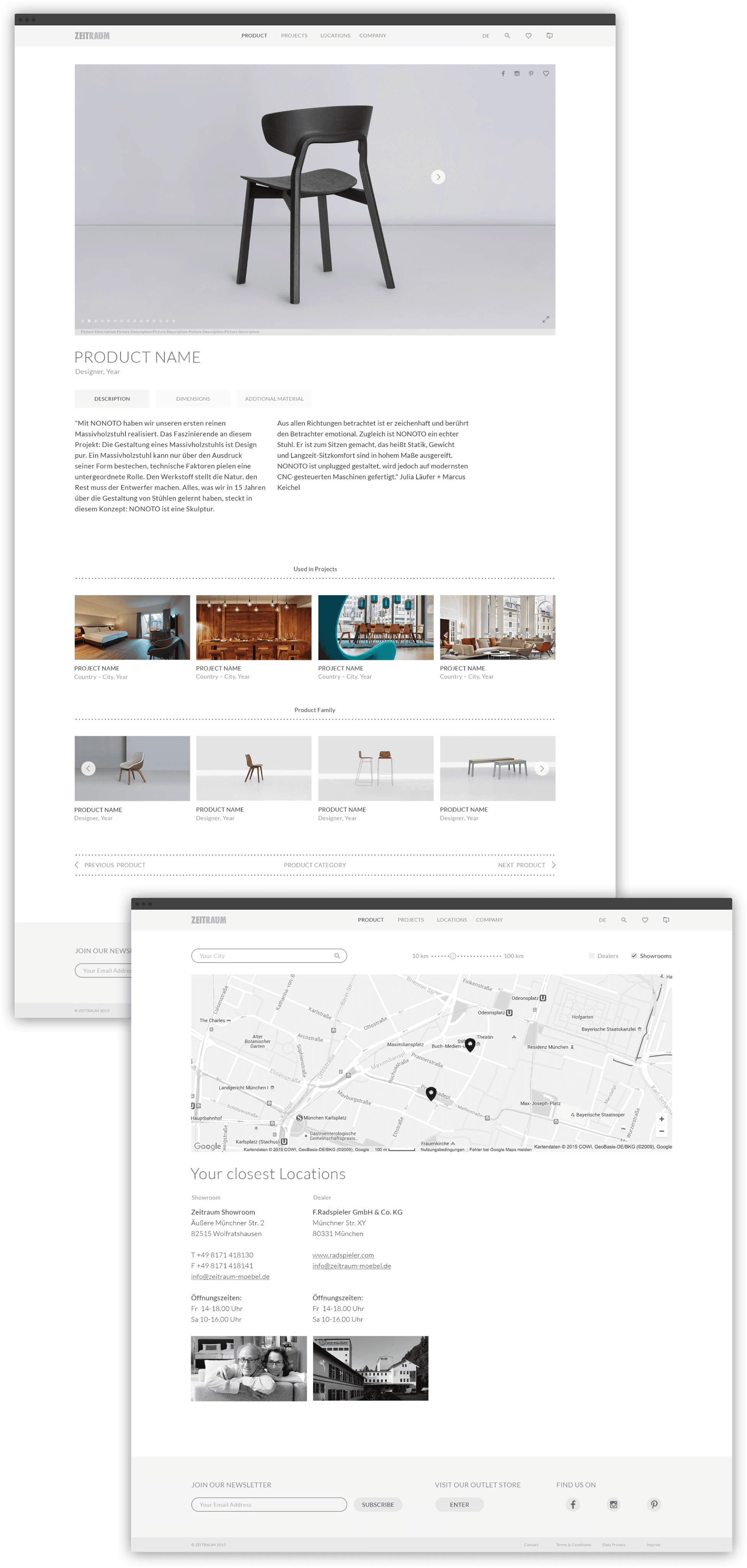
Developing UX guidelines and a design system that embodied Zeitraums's brand legacy and is easily replicable in the digital environment.
Mapping out the information architecture to identify pain points, reorganising it & simplifying it.
Using prototypes to communicate and bridge the client's knowledge gap and fear of change.
impact
Successful revamp of the Zeitraum website including extended client briefing.
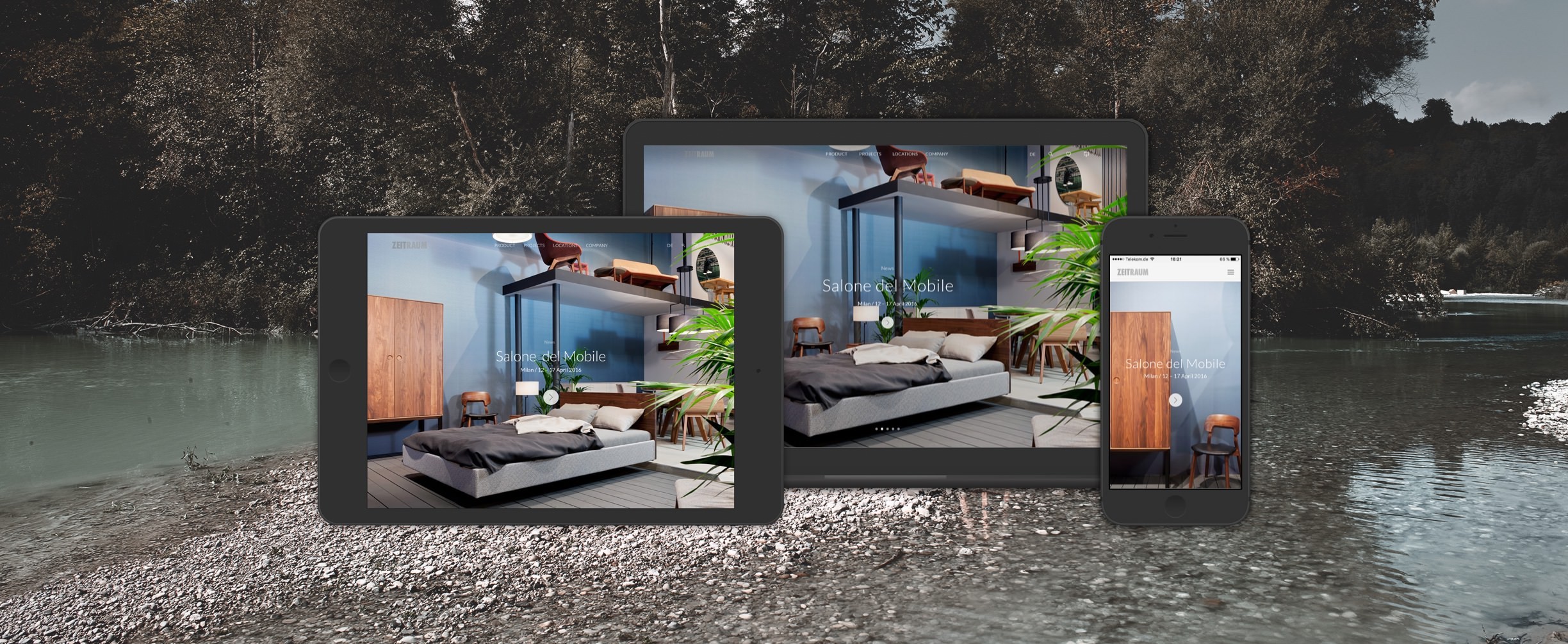
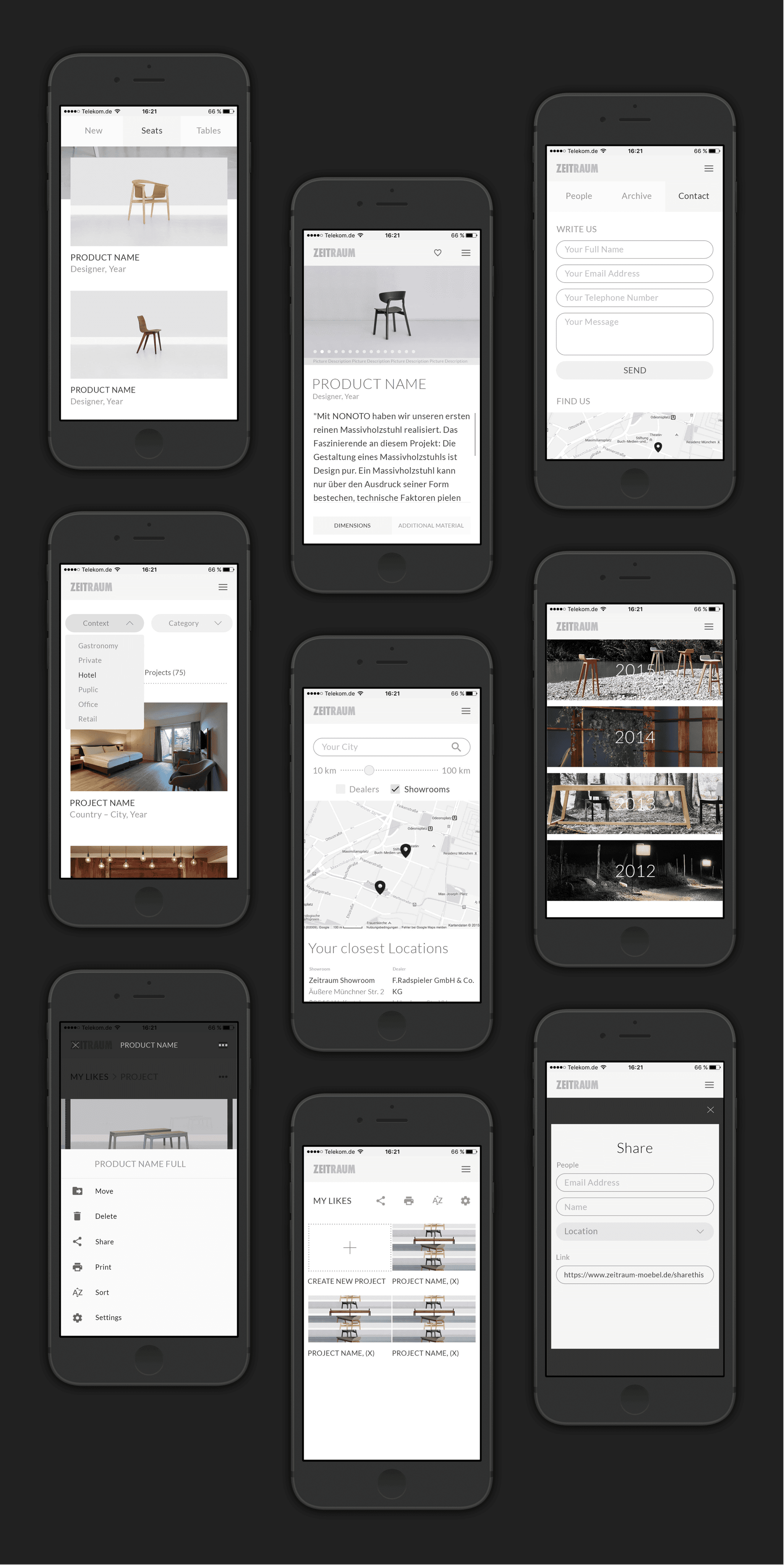
Enhanced user experience across different devices through meticulous attention to responsive design principles, ensuring seamless navigation and strong usability.
Strengthening brand loyalty and perception through a thoughtful and engaging user experience.
